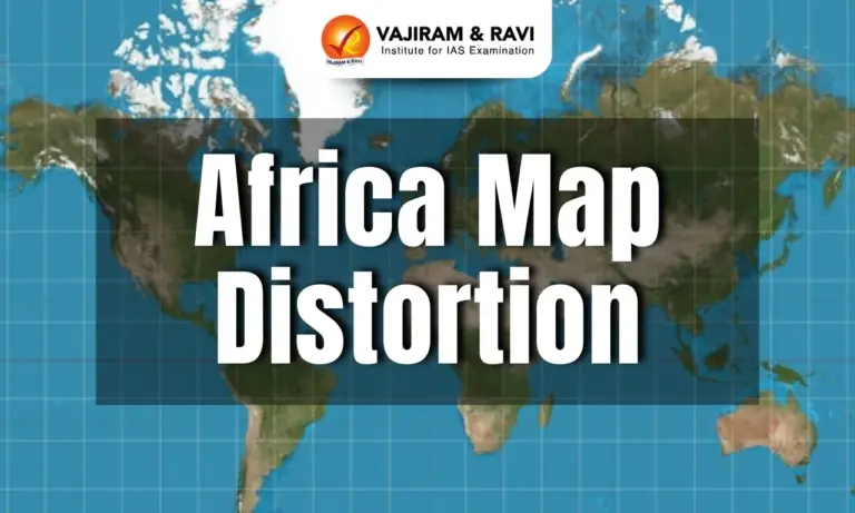
Africa Map Distortion Latest News
- The African Union (AU) has endorsed the Correct the Map campaign, calling for the replacement of the Mercator projection with alternatives like the Equal Earth map.
- The Mercator projection, still widely used in schools and media, distorts geography by shrinking Africa and inflating Europe, North America, and Greenland.
- The AU argues this has perpetuated symbolic marginalisation for centuries and believes adopting a fairer projection will restore geographical accuracy and dignity.
Why the Mercator Map Faces Criticism
- The Mercator projection, created in 1569 to aid navigation, allowed sailors to follow straight rhumb lines across seas, revolutionising European exploration and colonial expansion.
- A rhumb line (also called a loxodrome) is a line on the Earth’s surface that crosses all meridians at the same angle.
- It represents a constant compass direction (e.g., always going northwest at 45°). On a globe, this path is a spiraling curve toward the poles.
- On the Mercator map projection, rhumb lines appear as straight lines, which is why the Mercator map was so useful for sailors in the Age of Exploration.
- However, this convenience came at the cost of distorting scale: landmasses near the poles appear much larger, while those near the equator are shrunk.
- For instance, Africa (30 million sq. km) is shown as nearly the same size as Greenland, which is actually 14 times smaller.
- Similarly, Europe appears comparable to Africa, despite being only one-third its size.
- Over centuries, the Mercator map became the default in classrooms, offices, and digital platforms, reinforcing a Eurocentric view of the world.
- Critics argue that these distortions have subtly shaped perceptions of power and importance, diminishing Africa, South America, and Asia while inflating Europe, Russia, and North America.


Why Maps Are Distorted
- All world maps are distorted because it is mathematically impossible to flatten the Earth’s spherical surface onto a rectangle without compromising area, shape, distance, or direction.
- The Mercator projection, for instance, preserves local shapes and angles but greatly enlarges landmasses near the poles, making Europe and Greenland look much bigger while shrinking Africa and South America.
- In contrast, the Equal Earth projection maintains the relative sizes of continents and countries more accurately, but introduces curved or stretched shapes.
- Equal Earth projection was introduced in 2018 by cartographers Bojan Šavrič, Tom Patterson, and Bernhard Jenny.
- It minimises distortion of landmass sizes; Africa and other equatorial regions shown proportionally.
- The orthographic projection offers a realistic view of Earth as seen from space, yet shows only one hemisphere at a time and compresses areas at the edges.
- Each projection, therefore, reflects a trade-off between accuracy and usability, with political as well as technical implications.
Impact of Map Distortion on Africa
- The Mercator projection has long reinforced Africa’s marginalisation by shrinking its size, creating the perception that the continent is less significant.
- This distortion, embedded in textbooks, policymaking, and popular culture, suggested—whether intentionally or not—that Africa was small, conquerable, and irrelevant.
- Critics called the map a “political tool” that aided colonial domination, while it falsely depicted Africa as marginal.
The Road Ahead for Correcting the Map
- The Equal Earth projection, developed in 2018, is the leading alternative to the Mercator map as it preserves relative areas, though continents appear stretched or curved.
- Other options include the Gall-Peters projection, which also preserves area but elongates landmasses vertically, and creative efforts like Stuart McArthur’s 1979 “Universal Corrective Map” that inverted the world to place Australia on top.
- The African Union’s endorsement of the Correct the Map campaign marks the strongest institutional push yet, with support also coming from the World Bank, National Geographic, NASA, and petitions to the UN for adoption.
- However, replacing the Mercator projection will be challenging since it is deeply entrenched in schools, textbooks, digital platforms, and institutional use.
- It would require significant curricular revisions and interface redesigns to shift global cartographic norms.
![]() Last updated on March, 2026
Last updated on March, 2026
→ UPSC Final Result 2025 is now out.
→ UPSC has released UPSC Toppers List 2025 with the Civil Services final result on its official website.
→ Anuj Agnihotri secured AIR 1 in the UPSC Civil Services Examination 2025.
→ UPSC Marksheet 2025 is now out.
→ UPSC Notification 2026 & UPSC IFoS Notification 2026 is now out on the official website at upsconline.nic.in.
→ UPSC Calendar 2026 has been released.
→ Check out the latest UPSC Syllabus 2026 here.
→ UPSC Prelims 2026 will be conducted on 24th May, 2026 & UPSC Mains 2026 will be conducted on 21st August 2026.
→ The UPSC Selection Process is of 3 stages-Prelims, Mains and Interview.
→ Prepare effectively with Vajiram & Ravi’s UPSC Prelims Test Series 2026 featuring full-length mock tests, detailed solutions, and performance analysis.
→ Enroll in Vajiram & Ravi’s UPSC Mains Test Series 2026 for structured answer writing practice, expert evaluation, and exam-oriented feedback.
→ Join Vajiram & Ravi’s Best UPSC Mentorship Program for personalized guidance, strategy planning, and one-to-one support from experienced mentors.
→ Shakti Dubey secures AIR 1 in UPSC CSE Exam 2024.
→ Also check Best UPSC Coaching in India
Africa Map Distortion FAQs
Q1. Why is the Mercator map criticised for Africa’s portrayal?+
Q2. What is the Equal Earth projection?+
Q3. How has Mercator distortion impacted Africa?+
Q4. What alternatives exist to Mercator?+
Q5. Why is replacing Mercator challenging?+
Tags: Africa map distortion mains articles upsc current affairs upsc mains current affairs